Tag Archives: musings

New course – and new blog

I’ve decided to enrol on the new Context and Narrative course for my second Level One module and my new blog is here.  I’m both excited and nervous about the new course; my study pack arrived today and I’m looking forward to getting started.

Not that I’m done and dusted with The Art of Photography by any means – there are still some loose ends to tidy up and I need to get my work ready for assessment in November – so I will still be posting on here for a while.


Camera club critique evening – 14 October 2013

My local camera club runs critique evenings once a month alongside the usual weekly programme so I decided to take along some images from my second TAOP assignment that I thought I might enter into the forthcoming open digital projected image club competition to see whether they were up to scratch.

The evenings are run by experienced club members, one of whom is a external club competition judge, and the aim is not ‘rip apart’ images but to provide a comfortable, non critical, environment for club members to give and receive constructive feedback on their work and for the less experienced to learn and more experienced to impart their knowledge if they so wish.  I was a little nervous beforehand as this was the first time that club members had seen any of my work but I was made to feel welcome and given helpful, friendly guidance on the images that I presented.

The first thing I learned is that there seems to be a definite ‘feel’ (I think ‘type of image’ is too narrow) to an image that would be likely to do well in a club competition.  I’m not sure that I’m able to define this yet; I think I can see it but cannot put it into words at the moment, apart from the fact that I think the image has to connect with the viewer/judge.  Maybe the easiest way is to show my three images that got the thumbs down (albeit in a nice way) and the two that the people at the meeting thought had competition potential:

Thumbs down:

200mm, f/13, 1/200, ISO 400

Image 1

260mm, f/9, 1/200, ISO 100

Image 2

56mm, f/10, 1/250, ISO 100

Image 3

To improve these images it was suggested that image 1 needed an interrupter to the rhythm (one fun suggestion was a balloon tied to the railings!), that for image 2 I could line up the diagonal exactly with the top left-hand corner (a simple crop would do this) and that for image 3 I could ‘lose’ the small dark triangle at the top-left corner and lighten the shadows bottom-left to increase the tones.  All very helpful and positive advice (apart from tying a balloon to the windows of Deutsche Bank – I’d probably get arrested!)  so I’ll have a bash at remedying these points.

Thumbs up:

200mm, f/10, 1/500, ISO 320

Image 4

50mm, f/4.8, 1/500, ISO 100

Image 5

Both these images were thought to be worthy competition entries and were discussed in some detail by the group.

Image 4:

A crop was suggested to remove the small piece of black shadow on the left-hand side and to tighten the frame on the right, also to remove the small piece of window-sill above the second pillar:

200mm, f/10, 1/500, ISO 320

Image 4 – before

Image 3 - after

Image 4 – after

Image 5:

This was considered to be a powerful image.  Some chromatic aberration could be seen when the image was displayed on the projector screen, however this is easily removed in Lightroom.  The image seen in a larger size also showed up a small mark on the paving background in the bottom right-hand corner which again can be easily removed.

_DSC8629-Edit-3_sRGB_1000

Image 5 – before

Image 5 - after

Image 5 – after

Having submitted my images for critique I expected to receive some constructive criticism and I was pleased with the feedback I got on all my images.  Now onward to competition night on 24 October.

The psychology of selfies

I read an interesting article in last week’s Stylist magazine about the self-taken photograph and the psychology of ‘selfies’ [¹].  It seems that selfies (‘a photograph that one has taken of oneself, typically one taken with a smartphone or webcam and uploaded to a social media website’ [²] )are now accepted as a means of communication, as a way of projecting ourselves as more and more people communicate through online social media.  The article asks why would people choose to post self-taken pictures of themselves online, thereby sharing themselves with others, often with strangers, and looked at four women who frequently do so. In each case, a psychotherapist gave his view on what he believed to be the driver behind the need to post selfies and to share them with a wider audience.  The full article can be read here.

The case studies were interesting and diverse. One woman hates being photographed so that by posting selfies she feels in control of how she looked and where the photographs would be seen. Another, who is a freelance beauty writer and tv presenter, posts selfies as a means to do her own PR, using social media as a way to promote herself in a competitive market.  A third girl works in PR; as a user of social media to communicate in her work, selfies are a natural part of her life.  The final woman interviewed uses self-taken photographs as a way of documenting her goals visually;  to motivate herself and also as a memento of her ‘journey’ (in her case training for a marathon).

It would seem that there are numerous reasons why people choose to post self-taken pictures of themselves online, ranging from insecurity; the need for external validation from others yet with the wish to control how they are seen, through to the carefully chosen self-promotion of ‘you’ as a brand. However issues can arise; the article points out that it can be damaging for a person’s self-esteem to be entirely dependent on the views of others and that negative feedback can be difficult to handle.  Social media images can also be sought out by anyone through the use of search engines, resulting in a loss of control over who views them.

I take my photography seriously so my initial reaction to the article I must admit was one of disdain and I questioned whether selfies have a place in the photographic world.  To be honest I can’t see selfies becoming part of my life and the article itself asks whether selfies are ‘self-expression or a malady of the techno-savvy world?’ (p.64).  However, in response to my questioning I think I missed the point of the selfie.  I’ve realised that selfies aren’t a threat or an attempt to undermine the more serious side of photography, or indeed photography as an art.  They are more a way of communication, a means of self-expression.  I think that used carefully and with dignity selfies can provide poignancy to someone’s story.  As well as illustrating the glamorous and sometimes fatuous side of social media, they can also draw attention to and explore the less superficial areas of people’s lives, being used as documentary and motivational aids.  Maybe more importantly they can create memories.

[1] Source: Stylist magazine, issue nr 187 dated 28 August 2013.  Available online from http://www.stylist.co.uk/people/the-psychology-of-selfies   [accessed 28 August 2013]

[2] Source: Oxford Dictionaries [online].  Available from http://oxforddictionaries.com/definition/english/selfie  [accessed 02 September 2013]

Dithering over Assignment 2

Having debated whether to use cars (or rather bits of cars) as the subject group for my Elements of Design assignment,  I rejected that idea for various reasons (see my post ‘Assignment two – first thoughts‘) and had decided to go with buildings for my theme.  I’ve started researching architectural photographers and making a list of possible shots, and all was going well until a random remark by a fellow student over lunch today about how another student had used a bike for this assignment brought the whole car idea flooding back. To be honest it’s been lurking in the back of my mind over the past couple of weeks anyway and the only way I’m going to get this sorted is to try some test shots tomorrow and see how they work. Then I will make a decision – and this time stick to it.

I’m a bit perturbed by this indecisiveness as I hate dithering and not knowing what I’m doing.  I like things to be organised and straightforward so that I can get on with whatever I’m supposed to be getting on with.  I need to have some sort of plan, however vague, for a project otherwise I feel lost and in a muddle.   I’m aware that I’m wasting time too by prevaricating. So tomorrow is decision day.

Hooray! My lens is back!

I’m just so glad that my ‘walk around’ lens (ie my beloved 18-200mm) is now back from the Nikon repair centre, having had a replacement part to cure the lens creep as well as an extensive MOT.  I’ve managed OK (better than expected to be honest) using my 70-300mm to take pictures for some of the Elements of Design exercises, but I do prefer the all-roundness of the 18-200mm for general purpose photography.

That said, there were a few things that I noticed using the 70-300mm as my regular lens; some good, some bad and some just interesting:

  • Due to the lack of wide-angle available I found I had to take specific ‘bits’ of pictures rather than the whole scene in front of me.  I did miss the lack of scope  of the 18-200mm here and at first felt quite restricted.
  • Following on from the point above, I found I was looking at things in a different way, looking more for details and textures.  I’ve just studied the work of Ernst Haas and also looked briefly at some of David Maisey’s images so it was interesting to follow in their steps and look for details.  Haas in particular had the skill to see ordinary things that most people would not notice and turn them into extraordinary images.
  • I had to move around far more to get the shot I wanted.
  • I found I had to take much more care with framing.  I found this surprising as I thought I took care anyway, but it was definitely noticeable.  I think this was because I was taking quite tight shots.
  • Up until this point I have never felt uncomfortable walking around with a fairly big camera (D7000), but I did feel conspicuous with the bulk that the 70-300mm lens added when in everyday places.  In fact one weekend I used my Samsung NX5 compact system camera when out with relatives.  Part of that decision was not wanting to look as though I was showing off, being ‘flash’ with a big camera.
  • The upside of the point I’ve just made is that I found I could sit quietly in a corner or at a a table and zoom in on unsuspecting people so it was great for this aspect of ‘street’ photography.
  • Finally I found I was treated as a ‘serious’ photographer by the general public – people moved out of my way more readily when they could see I was looking to take a shot and I was also asked quite a few times to take pictures of other people using their cameras, presumably because they thought I knew what I was doing.  This raises two interesting questions – does large equal better?  Does a bigger camera automatically make you a better photographer?  In my view, no on both counts.

To sum up, I’m glad to have my 18-200mm back and yes, it’s much more convenient to have as my general-purpose lens but using the 70-300mm was a useful and interesting experience.  I learnt some valuable lessons and also realised that the wide ranging zoom on the 18-200mm has made me a trifle lazy.

Feeling lost today …

… without my 18-200mm ‘walk-around’ lens.  Yes, after my issues (for ‘issues’ read ‘minor hysterics’) with lens creep (see here) it is finally winging its way to the Nikon repair centre as I write, hopefully to be tightened and restored to its former glory.  I’ve cut it a bit fine to say the least  as the warranty expires in three days time, but it got me through my first assignment, on one occasion with the zoom ring held in place with sticky tape (tutor, look away now please).  So I’m now embarking on Part two of the course with my 70-300mm zoom – good thing I wasn’t planning on doing any discreet street photography…  Oh well, onward and upward.

Artist: Piet Mondrian – dividing the frame

In his introduction to the coursework project ‘Frame shapes and sizes’, Michael Freeman mentions Piet Mondrian as an artist who is noted for his painting of complex yet balanced sub-divisions of the frame so I thought it was worth taking a look at his work in the context of the coursework and with specific thoughts of balance in mind.

Mondrian (1872-1944) developed a style by building pictures using simple elements of straight lines and primary colours which he then moved around the canvas to find the perfect composition.[1]   Along with Theo Van Doesburg, he was a leading member of the De Stijl movement whose artistic philosophy was known as neoplasticism and had the goal of making art as simple as basic as possible, distilling it to a level of almost scientific precision and perfection.[2] 

Having finally got to grips with the Golden Section, I can see how Mondrian uses this compositional principle in some of his work; ‘Composition B (No.II) with Red‘  and ‘Composition C (No.III with Red, Yellow and Blue‘ being just two examples.  I find the tautness of the lines and the incisiveness of the rectangles compelling, obsessive even.  ‘Less is more’ in Mondrian’s geometric world and I like the simplicity of his art. Yet however stark his geometrics, I can see that his use of proportional division still creates harmony and balance in his work.

[1] ‘The Art Book’ (1994)  Phaidon Press Ltd London  Page 321

[2] EmptyEasel.com – The De Stijl Art Movement (also known as Neo-Plasticism) [accessed 01 April 2013]

Getting to grips with the Golden Section

In his introduction to the coursework project ‘Frame shapes and sizes’, Michael Freeman writes about the Golden Section as being one of the most well-known ways to classically divide the frame.  The principle is based on geometry and the basis of the calculation is that ‘the ratio inside the frame, from the small part to the large part, is the same as the ratio between the large part and the whole’ (p.59).  Try as I might, I could not get my head around this – it may as well have been written in Russian.  Freeman writes more in depth about the Golden Section in ‘The Photographer’s Eye‘ (2007) and how it is the best-known ‘harmonious division’ (p.26), explaining that the ratios are tied together, giving rise to a sense of harmony.

All very well, but I still don’t get it.  Next stop in my research is Bryan Peterson. In his book ‘Learning to See Creatively’ (2003), Peterson describes how the Golden Section was devised by the ancient Greeks as a proportion guideline, referring to ‘a rectangle with longer sides that were roughly one third greater than the shorter sides’.  This proportion became the standard for a lot of the ancient Greek architecture. Peterson then talks about how artists were laying an imaginary grid of two evenly-spaced vertical and horizontal lines over the rectangle, which became known as the Rule of Thirds.  All very interesting, but no mention of Golden Section ratios within an image here.

OK, now time for some on-line research.  I found a good explanation here.  Although a web-site mainly for artists, it provides a helpful diagram as well as some examples of the Golden Section applied to images.  This has raised another question though.  On the photography side, do I concentrate on placing my subject in the rectangles (as shown in the examples in the link) or on the intersection points (as per the Rule of Thirds)?

Why is life so complicated?

I then went back to Michael Freeman, this time to ‘The Photographer’s Mind’ (2010) and it all fell into place.  Freeman provides an ‘exploded diagram’  (p.102) to illustrate the ratios of the Golden Section within a rectangle and this suddenly made it clear.  I will not provide a copy here for copyright reasons but I’ve put a photocopy in my sketchbook for reference.  Freeman also illustrates the Golden Section by  showing how it divides the frame on two of his images (p.102) and here it is clear that a photographer applying the Golden Section would place the subject in the rectangle rather than on an intersecting line.

So my understanding now of the Golden Section and the Rule of Thirds is as follows:

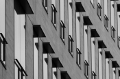
i)  The Golden Section is a way of dividing the frame so that the ratio inside the frame, from the small part to the large part, is the same as the ratio between the large part and the whole.  This creates lines of division, both horizontally and vertically, fairly similar to those of the Rule of Thirds.  However it seems that the Golden Section is less about the lines and intersections and more about balance and proportions, placing the subject inside one of the created rectangles in order to create balance within an image.

ii) The Rule of Thirds is a simpler idea, dividing the frame into three equal sections, both horizontally and vertically, thus creating an even grid of rectangles.  The grid lines, and in particular the intersections, are considered useful places to put the subject in order to achieve a balanced composition.

What I’ve found of value from my research is understanding that the areas of a rectangle divided by the Golden Section are tied together by ratio, providing a sense of harmony.  I’ve also now discovered that one of the ‘crop overlay’ options in Lightroom is a grid for the Golden Section.  This will make life a whole lot simpler when analysing my images.

I’ve been using the Rule of Thirds for a while now (one of the first things that I learned at evening class) and am happy with it; nowadays I use it instinctively.  The Golden Section will take a bit of getting used to and I think that I will have to remember to use it at first.  However I’m pleased with the few pictures that I’ve taken consciously using it.  I must remember though that it is not a ‘rule’ to be used all the time regardless; Freeman makes this  very clear in the course notes.  However, in ‘The Photographer’s Eye‘ (2007) he does suggest that if a photographer is familiar with which proportions provide harmony in an image their intuitive compositional skills will become more finely honed.

An unexpected bonus …

… to find a small exhibition of Ray Mears’ wildlife and nature canvasses yesterday.  Having had a wander around Stonham Barns near Stowmarket I dropped into the coffee shop for a much-needed mug of hot chocolate only to find a selection of Mears’ images on display, which was a real treat.

Mears is a landscape and wildlife photographer (not to be mixed up with the ‘other’ Ray Mears, famous for bushcraft and survival skills) based in Norfolk.  I had first come across his work at the end of 2012  and although I am not a ‘follower’ of wildlife photography I was impressed by the presence that his images generate through his style of taking, for the most part, tightly framed close-up shots and his use of brilliant colour when appropriate.  His images can be seen here on his website.

There were nine canvasses on display, mostly of wildlife with a couple of nature images included.  Of the latter I found the clarity of ‘Woodland Walk‘ striking, particularly as the image was on canvas.  Mears has captured a real sense of depth here, with front to back sharpness, and I like the way he has captured the light coming through the trees; by accentuating textures and providing contrasts he has made a fairly everyday scene into something special.

In my view, where Mears excels is in his wildlife images.  The seven that were on display were stunning.  He achieves close-up shots that reflect the character of the subject and yet he retains sufficient background detail to show the setting.  My favourite from yesterday has to be ‘Eyes Right’ from his kingfisher collection, due to the brilliant colour and the fine detail that Mears has captured in the feathers.

On his website, Mears writes about his belief of keeping his images real, with minimal adjustments and I think that this ethos adds to the quality of his photography.

So that mug of hot chocolate was worth its weight in gold to me yesterday.

Not the best timing in the world …

… for my zoom lens to decide not to play ball.  I was out in the City this lunchtime photographing some modern buildings to practise frame dynamics (as discussed by Michael Freeman in The Photographer’s Eye (2007)) and to get some shots for the ‘Vertical and horizontal frames’ exercise when my 18-200mm lens decided to develop lens creep when pointing vertically upwards.  It’s kind of bizarre when your 70mm focal length collapses gracefully to 18mm of its own volition.

Now I know that it isn’t the best lens in the world but it suits me as a ‘walk-around’ lens, especially in London where I am constantly zooming in and out on various subjects and don’t want the faff of changing lenses in dusty streets.  Luckily it’s still under warranty so I will despatch it off to Nikon for repair.  It obviously has a warped sense of humour though as this is the worst timing for it to malfunction; I have booked some days off work before Easter and am planning on starting to shoot the images for the first assignment.  So I guess I will be resorting to sticky tape and sweet talk for those upwards shots until the assignment images are in the bag.  Strangely enough (and thank goodness) there is no lens creep downwards.

I also have a 70-300mm lens which will stand me in good stead when my other lens is away being repaired, but I do prefer having the full range of 18-200mm focal lengths available as I like the flexibility.

Oh well, onwards and upwards as they say.